WebsitesCase studyWebsite
A product range that grew one idea at a time.
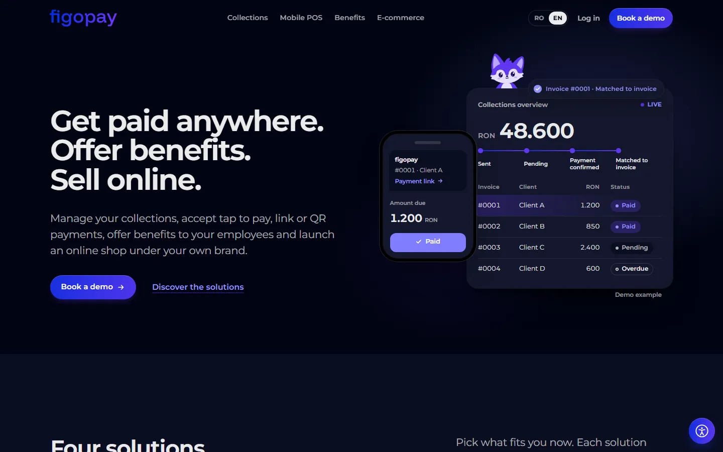
I’m the product designer at figopay, a fintech whose products arrived one idea at a time: an app that turns a merchant’s phone into a card terminal, payment links, a benefits platform, white-label shops and the public site. I design them, and I built the site and the benefits platform’s frontend.
- Company
- figopay, fintech
- Role
- Product designer
- Built
- figopay.ro and the social.coupons frontend
- Focus
- Accessibility
The challenge
figopay did not start with a plan for a range of products. The ideas came over time, as the team found new things worth building: an Android app that takes card payments on the merchant’s own phone, payment links a merchant can send on WhatsApp, a benefits platform where employees spend the budget their company gives them, white-label online shops, and the public site that explains all of it. Each one shipped on its own schedule, set by partners and launches rather than by the design process, and the backend changed under the designs more than once.
So the hard part was rarely a single screen. It was keeping products designed at different times feeling like one company, and making sure that a merchant taking a payment on an old phone and a customer paying with a screen reader could both get through it without help.
My role
I’m the product designer in a small team, where the backend, the payment processing and the printed materials are other people’s work. I design figopos, the app merchants take payments with; the payment page a customer opens from a link; social.coupons, for both the company that shares out the budget and the employees who spend it; the white-label shops; and figopay.ro. On two of them I also wrote the frontend: social.coupons, and figopay.ro, which I designed, built and wrote the copy for, from the information the team gave me.
figopay’s fox, Sofi, is mine too, and how she was made has its own chapter below.
Key decisions
- One component set, themed per product. The web products share the same components with different themes, so a fix in one reaches the others, and they look related without looking identical.
- Accessibility as the starting point, not a pass at the end. Focus order, contrast and text size are part of the first version of every flow, because fixing them later on a payment keypad is slower than designing them in. The figopos keypad and the result screen were tested with a screen reader and at 200% text size, and figopay.ro has an accessibility menu on every page for text size, high contrast, underlined links, reading spacing and stopping animations.
- Design for the backend that exists. When the API changed in the middle of a build, I changed the designs to match what actually shipped instead of waiting for the backend to catch up. Some of those changes made the flows simpler; a few I would still argue about.
Sofi, figopay’s fox
We agreed a mascot would help the marketing, and a colleague suggested a fox. I drew everything else: her shape, her colours, her expressions and the props she carries. The difficulty was what came after the drawing, because nobody on the team has a background in motion, we wanted to stay on free tools, and a mascot that only exists as a still image can’t react to a payment or carry a TikTok clip.


So I direct and Claude Code, an AI agent that writes and runs code, does the building. It turned my drawing into SVG, rigged her in Blender, and animates her, exports the animations and renders the videos, music included. My part is deciding what each scene should say, choosing between the ideas it brainstorms, reviewing every still pose before anything moves, and giving notes on every draft until it is right.
The first attempts moved her head, body and limbs as separate cut-out pieces, and it looked very strange: her leg seemed to come off when she leaned. A real rig, with about twenty bones, bendy arms, and ears and a tail that follow her movement, is what made her bend as one body. Rive would have suited it, but its production export is paid. Each animation now leaves Blender as a Lottie file of about 190 KB, an intro and an idle loop, so the same file plays on the website, in the apps and inside a video.
A few rules came out of the reviews. A beat lasts about five seconds, each clip is one continuous take, and a result has to read at a glance: green sparkles for a success, a red speech bubble with “!” for a failure. Her design is frozen, because Sofi is being registered as a trademark, so an animation can pose her and change her expression but never redraw her. She is on figopay.ro, in the payment links and social.coupons, where she welcomes people, fills empty screens and shows how a payment ended, and in clips on TikTok, Facebook and LinkedIn. One Halloween clip went through seven drafts in a day, each prompted by one small note.
Try it: the product map
Pick a product to see its screens and what I did on it. The two websites load live.
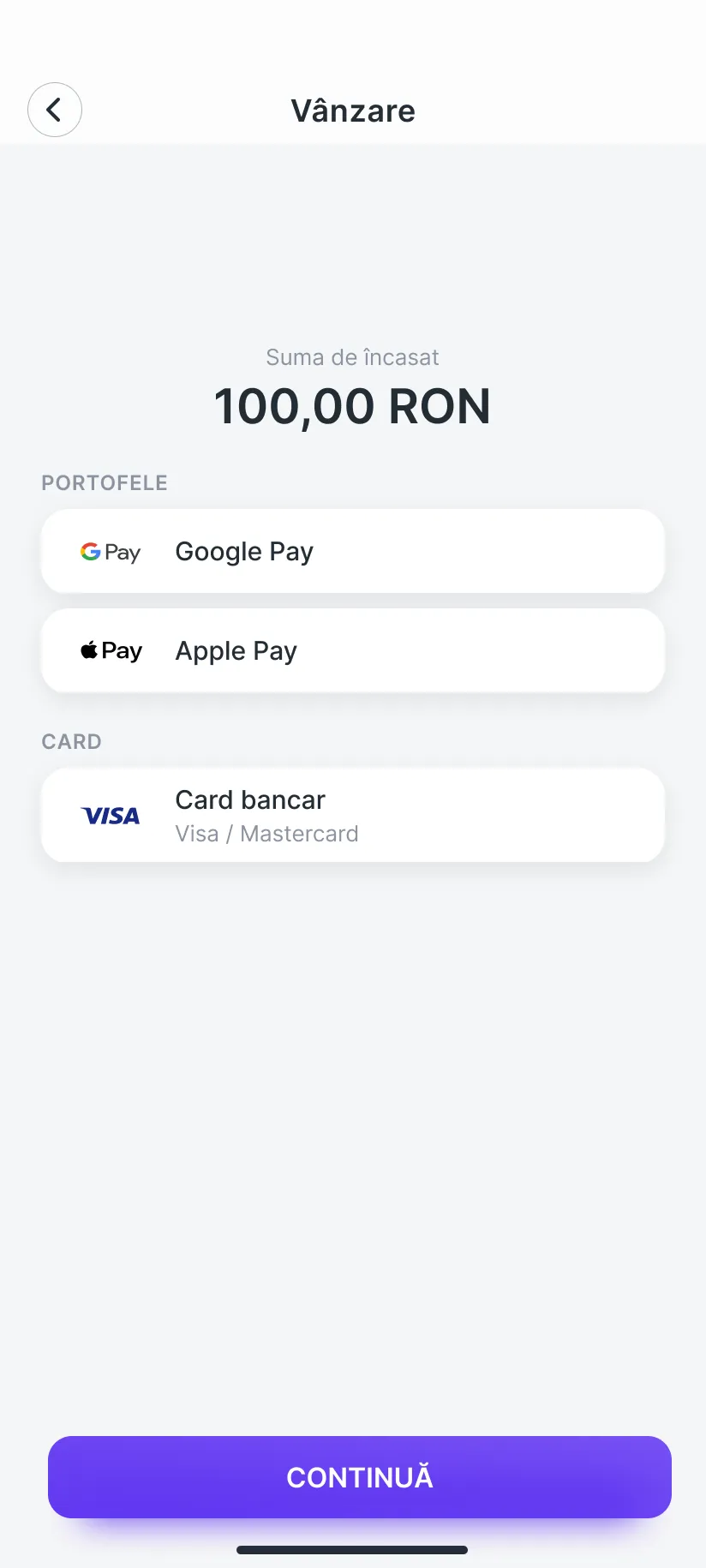
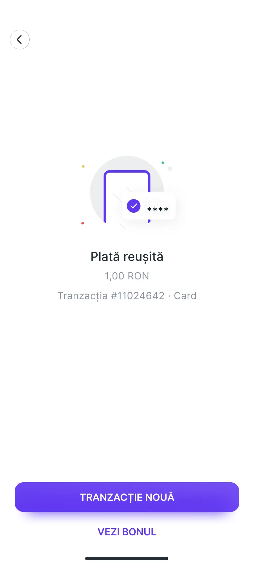
Android app
figopos
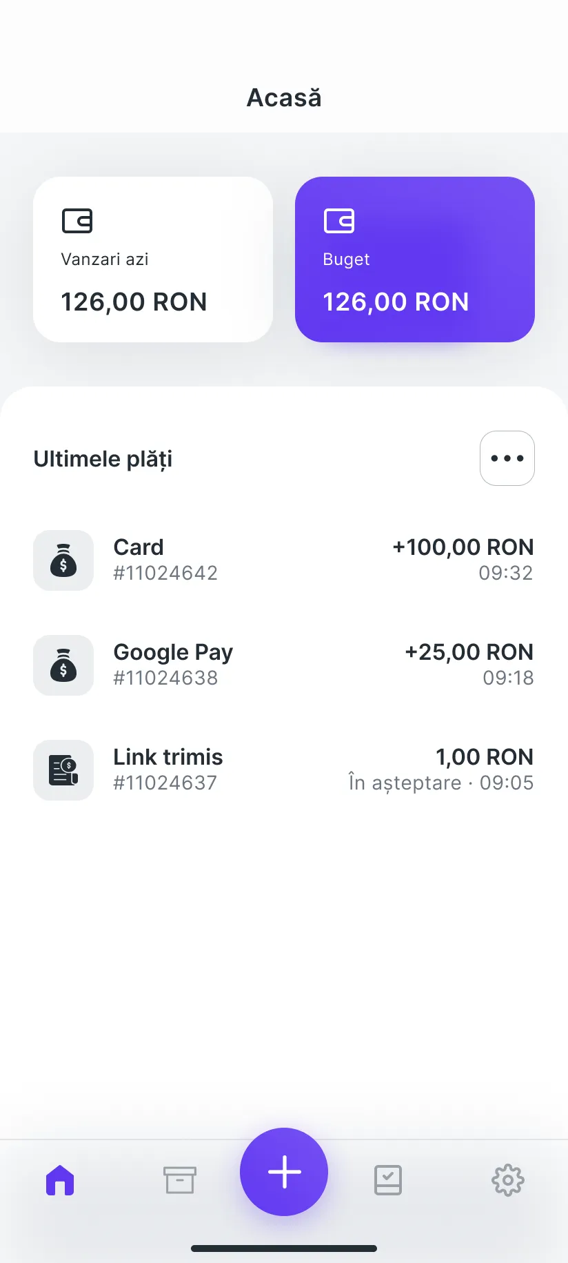
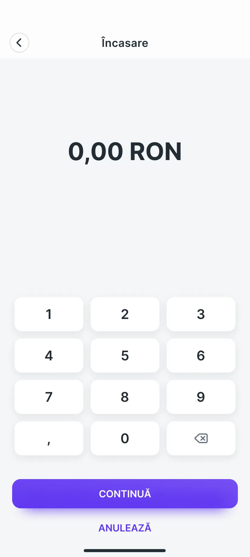
Merchants take payments on their own phone, with no terminal: the amount goes in on a keypad, then the customer taps their card or phone, opens a link sent on WhatsApp or scans the QR code on the screen.
My part
- Design
- Accessibility
The keypad and the result screen were tested with a screen reader and at 200% text size.
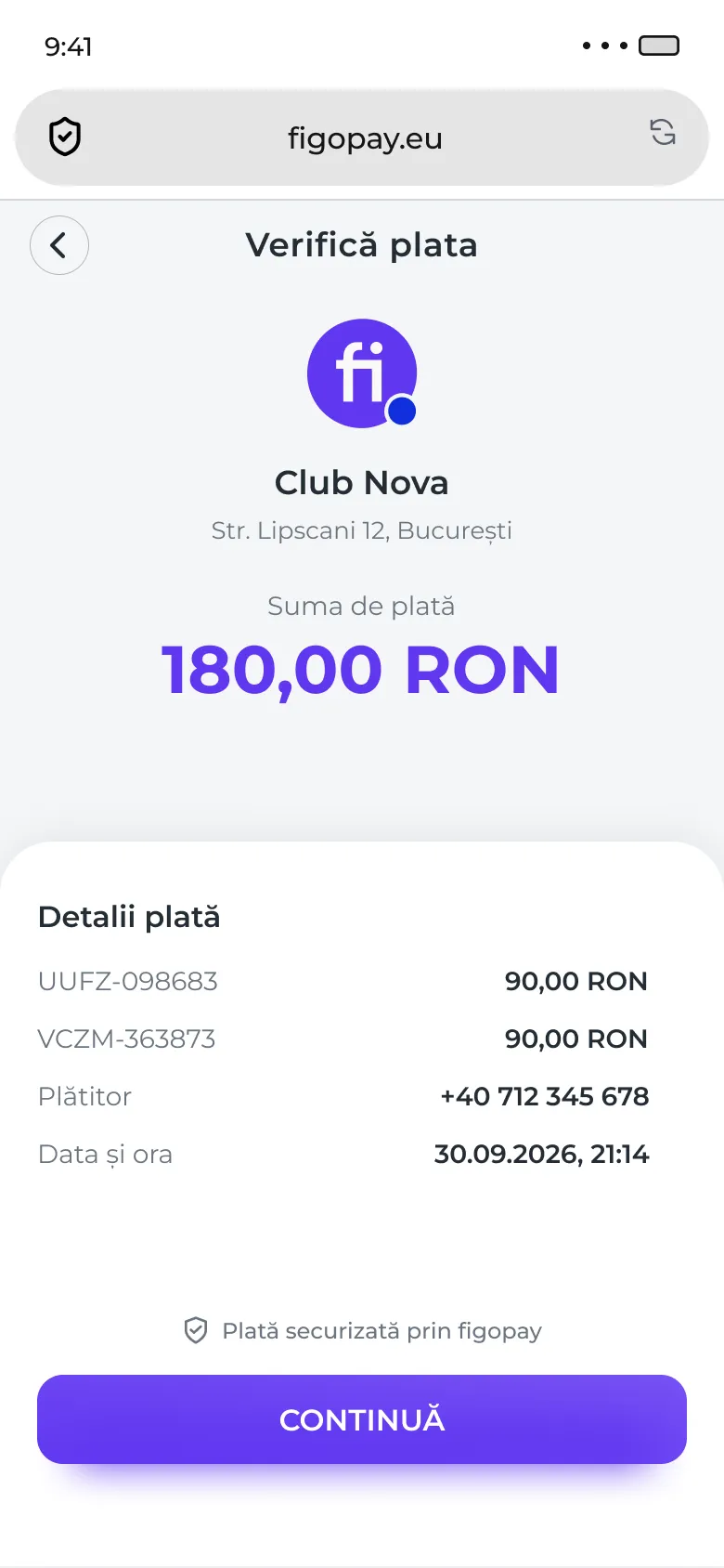
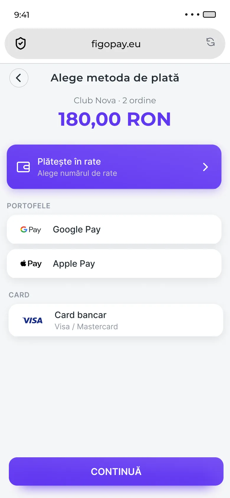
Web, on the customer’s phone
Payment links
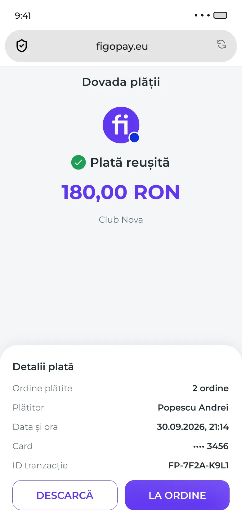
A link sent by SMS, WhatsApp, email or QR. The customer sees what they owe, pays by card, Apple Pay, Google Pay or in instalments, and the payment is matched to the invoice it was sent for.
My part
- Design
Every way a payment can end has its own screen: paid, declined, connection lost, session expired and already paid.
Web platform
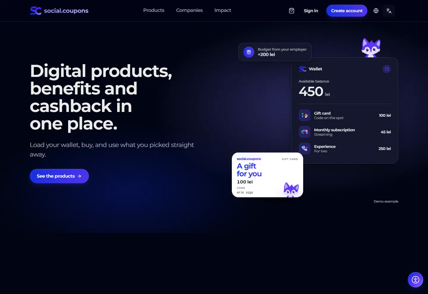
social.coupons
The company loads a benefits budget and shares it out to everyone, by department or person by person. Employees see it in their wallet next to their own top-ups and cashback, and spend it on gift cards, subscriptions, digital services and experiences.
My part
- Design
- Frontend
Two products in one: the company’s side, which shares out the budget, and the employee’s wallet and shop.
Open in a new tab: social.couponsLoading the live site…
Website
figopay.ro
The public site, in Romanian and English, that explains the four solutions and books demos.
My part
- Design
- Frontend
- Copy
- Animation
Built towards WCAG 2.2 AA, with an accessibility menu, light and dark themes, and animations that stop when the device asks for less motion.
Open in a new tab: figopay.ro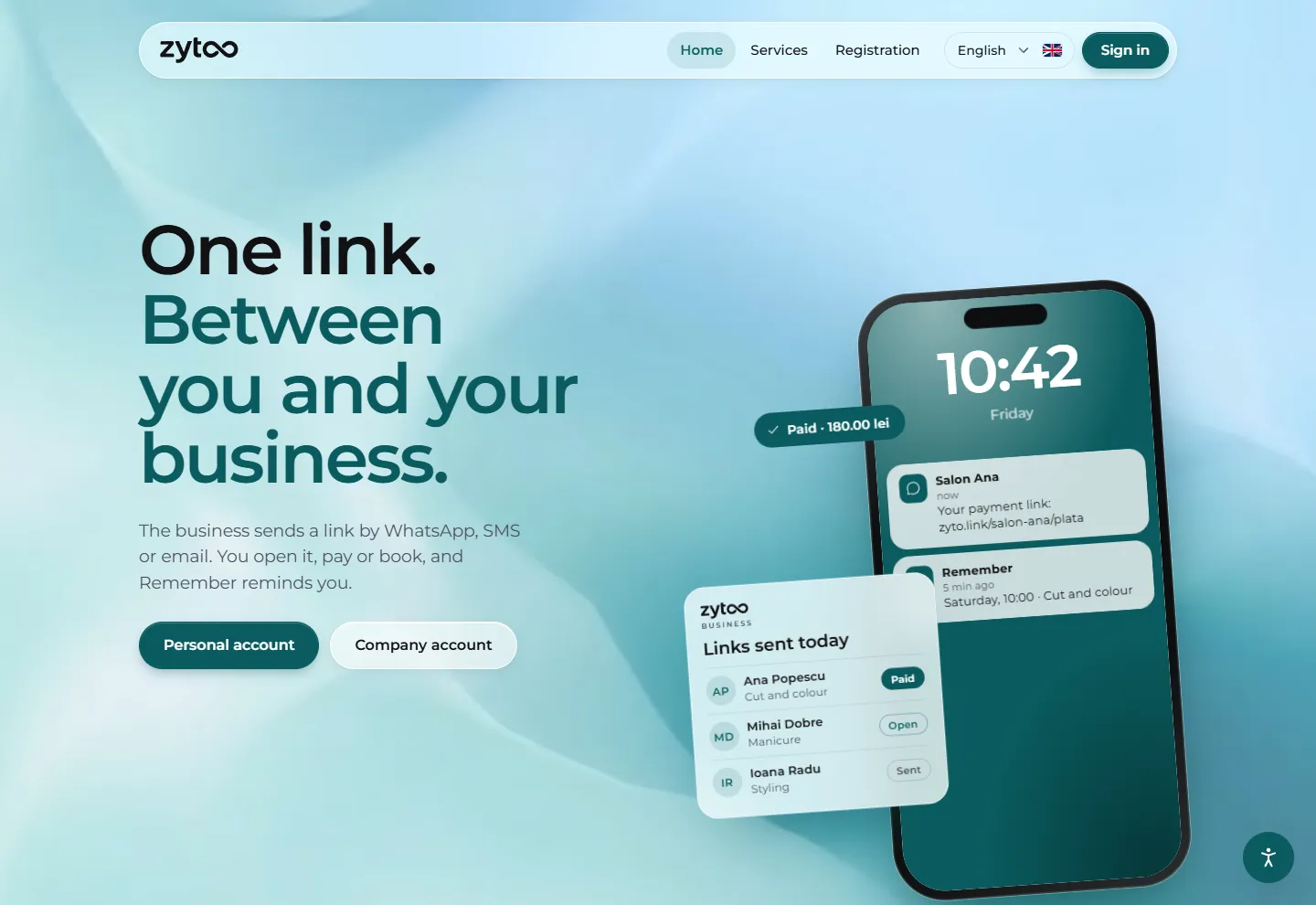
Nothing to show yet: it is still being designed.
In the works
QR stickers
Still in the works.
Outcome
figopay.ro, figopos, the payment links and social.coupons are live. I can’t share figures from them, so what I can point to is the work itself: the map above shows the real screens of the apps and opens the two sites as they are today, and figopay.ro is also in my Websites section. zyto and the QR stickers are still in the works.
What I’d do next
I would start the shared component set before the second product rather than after it; the first products were designed separately and brought together later, which cost time I would rather have spent on the flows. I would also turn the accessibility checks into a written checklist the whole team runs, instead of something that lives in my head and in design reviews. After that, zyto and the QR stickers are next.